The same living room. Four different palettes. Colour changes more than the overall look: it brings out different details and affects how we see the light. Here we look at what makes a room feel softer, livelier or more dramatic while the basic furnishing stays much the same.
The architecture holds. The atmosphere changes. Four studies of the same living room reveal how colour can redraw the balance between a sofa, a painting and the light around them. Follow what comes forward, what grows quieter, and which version you would want to come home to.
AI-generated concept image.
02Deep palettes
Two ways to find depth
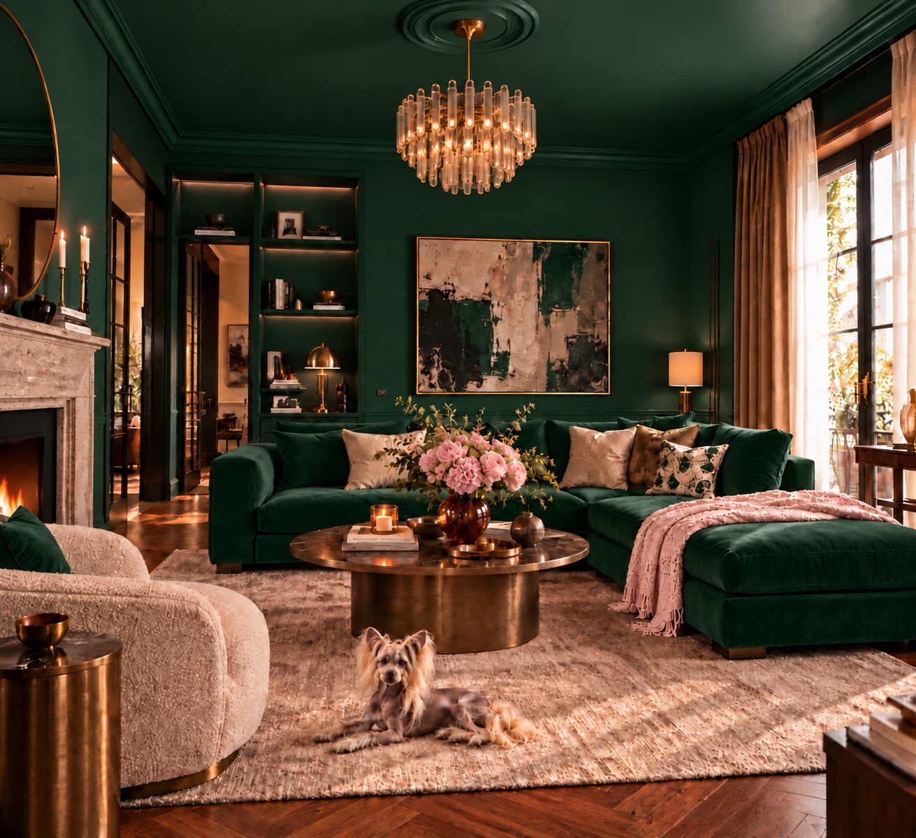
Emerald
Emerald lets the walls, ceiling and sofa read as one generous sweep of colour. Against it, the pale armchair and pink flowers become small, luminous pauses. The bronze-toned table gives the green a warm companion without competing for attention.
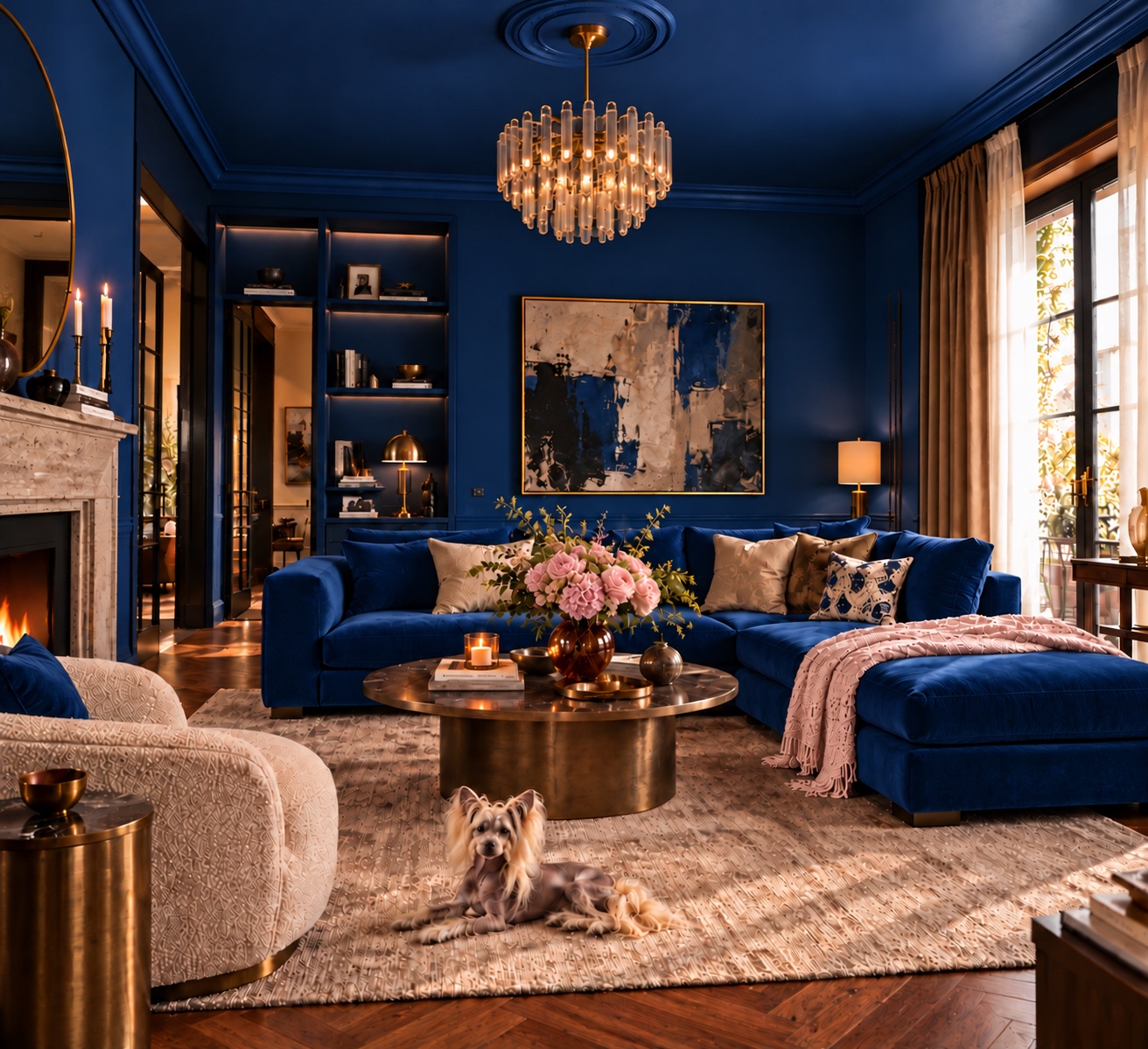
Sapphire
Sapphire draws a sharper line around the pale upholstery and fireplace. Look at the artwork: its blue passages now seem to reach into the room. The same chandelier feels more prominent against this cooler backdrop; its warm light keeps the blue from feeling remote.
The deepest colour needs somewhere for the eye to rest.
Rooms of Note · Note 0402
03Warm palettes
Warmth and lightness
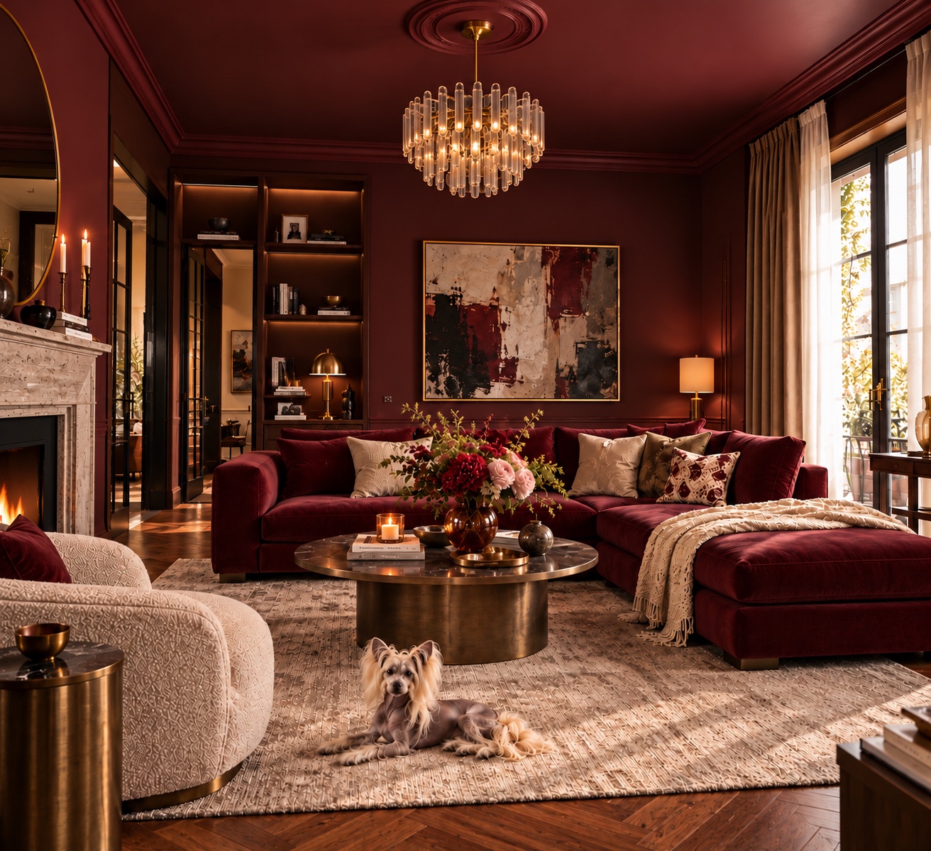
Burgundy
Burgundy brings the sofa and the surrounding walls into a close conversation. The coppery table and amber light carry that warmth through the room; cream cushions and the pale armchair leave enough space around it. Richness comes from those intervals as much as from the colour itself.
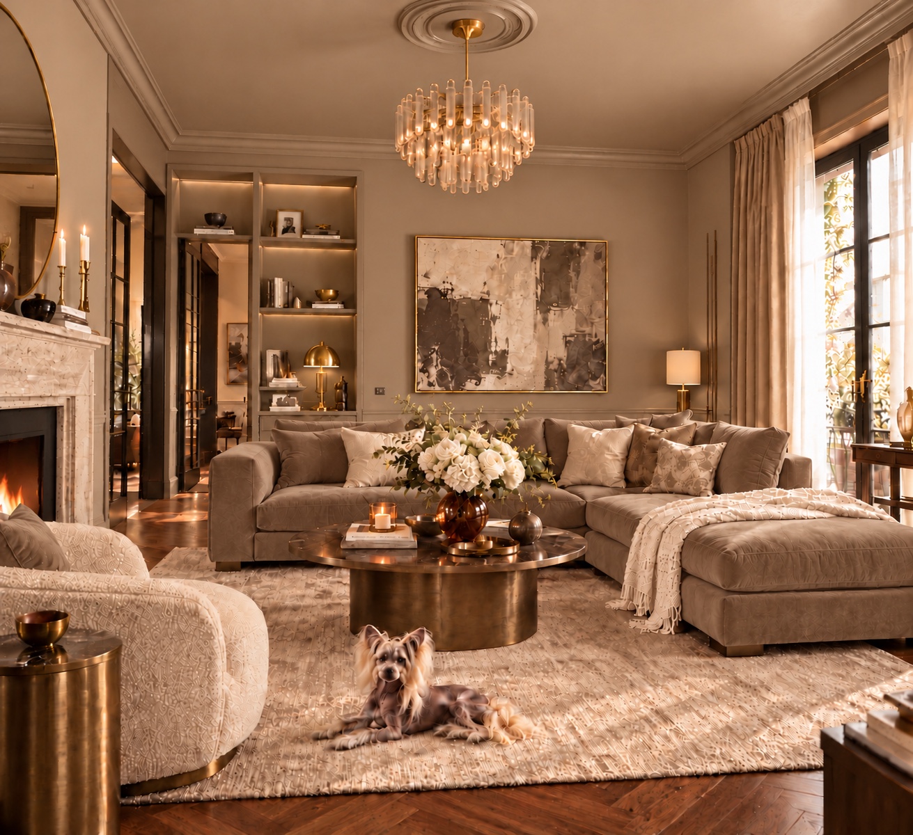
Champagne
Champagne moves the emphasis from colour to surface. The sofa is quieter, so the folds of a curtain, the grain of the floor and the outline of the furniture become easier to notice. The bronze-toned table supplies a darker centre, giving this softer palette a point of focus.
A quiet palette can still have a strong point of view.
Rooms of Note · Note 0403
04Colour equation
What changes the mood?
EmeraldSapphireBurgundyChampagne
01Scale of colour
Begin with the largest surfaces. Here, walls, ceiling and sofa change together, so their combined effect is greater than a new cushion or a single painted wall. At home, decide how much of the room you want the colour to occupy before choosing its exact shade.
02Contrast
Follow the pale armchair through the four images. Against emerald, sapphire and burgundy it reads as a clear shape; in champagne it belongs to a gentler sequence of tones. Keep one existing piece in view when comparing samples: it gives your eye a constant reference.
03Light
The window on the right and the warm lamps give colour two different partners. A swatch beside the window may look quite different under a lamp after dark. Check it in both places, using the bulbs you actually live with, rather than choosing under a shop’s lighting.
04Materials
Notice how the velvet-like sofa absorbs the light while the metal table catches it. Repeating a shade across unlike surfaces creates depth without adding more colours. Pair a paint sample with a fabric, a piece of wood and a metal finish before judging the combination.
Our responses to colour are personal and can vary across cultures.
Rooms of Note · Note 0404
05The Shopping Edit
Find Your Mood
Choose the palette that feels like you.
Emerald
For an enveloping room with a soft, botanical counterpoint.
Sapphire
For a crisp contrast between deep colour and pale upholstery.
Burgundy
For a close, richly layered atmosphere in warm light.
Champagne
For a quieter room where texture and shape do the talking.
Four colour studies of the same room. The images are inspiration, not a guarantee of an exact product match.
Four palettes. Choose your Shopping Edit.
Which mood feels most like you? Choose your favourite palette and request its free Shopping Edit. We look for products that suit that palette within the ranges offered in your country. We check the shopping information before sending it and flag anything we cannot confirm.
If we accept your request, we’ll email your Shopping Edit within 72 hours of sending you our acceptance email.